
How to read a weather map
25 June 2020
You might see it on the TV news or online, with its sweeping curves, dashed lines, and cryptic numbers. But what does a weather map actually tell you? Find out about some of its most distinctive and useful features to help you better understand the weather.
What is a weather map?
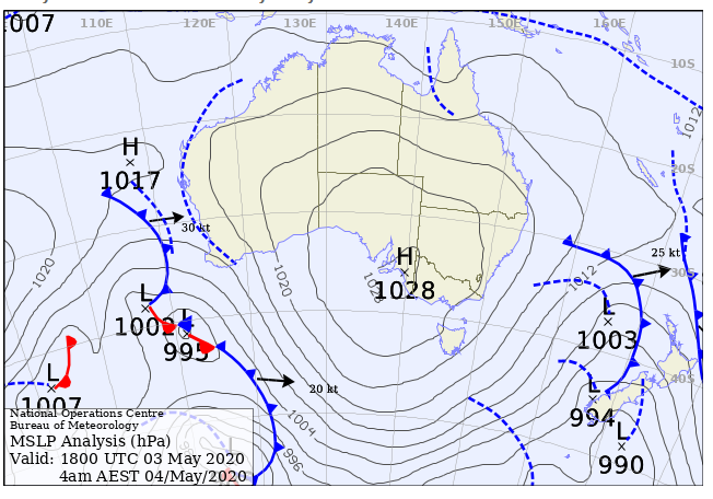
The weather map, also known as a synoptic (summary or overview) chart, is a simple representation of the weather patterns at the Earth’s surface, showing the locations and movements of the different systems.
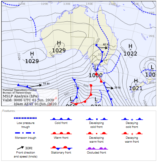
Image: A typical weather map.
What are the main features?
Isobars
Isobars are the plain lines curving across the map. They connect points with the same mean sea level air pressure (weight per square area of air above). Some isobars have numbers on them showing this value in hectopascals (hPa).
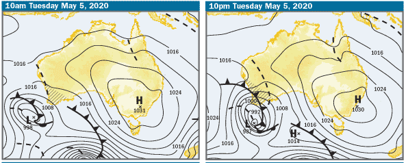
Isobars indicate the flow of air around weather systems. You can broadly interpret wind strength and direction from these maps. The general rule is that winds are strongest where the isobars are closest together. Thus, the strongest winds are usually near cold fronts, low pressure systems, tropical cyclones and in westerly airstreams south of Australia. Winds are normally light near high pressure systems where the isobars are widely spaced.
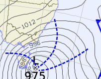
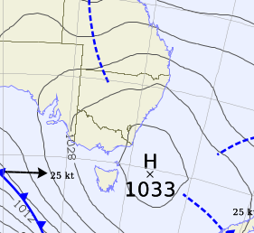
Image: Example of closely spaced isobars (indicative of windy conditions) and widely spaced isobars (calmer conditions).
High and low pressure systems
The number shown on high and low pressure systems indicate the central mean sea level pressure. Standard pressure at sea level is defined as 1013 hPa, but there’s no specific value that defines high vs low pressure—it’s all relative to the surrounding environment. A typical high is around 1020 hPa or higher, while a shallow low is usually above 1000 hPa, a moderate low 980–1000 hPa, and a deep or intense low below 980 hPa. An intense cyclone could even have a central low pressure of around 960 hPa or lower.
High pressure systems
A high pressure system is an area of high pressure relative to its surroundings. On the chart, it appears with an ‘H’ with the number indicating the pressure.
In the southern hemisphere, the wind flows anticlockwise around and away from a high pressure system. Air from the atmosphere above a high pressure system sinks down and warms as it does so. The sinking air is very stable so high pressure systems mean dry, settled weather and light winds.
Find out about ‘blocking’ high pressure systems which disrupt the flow of low pressure systems across southern Australia, and the sub-tropical ridge (a belt of high pressure systems) that is located south of Australia during the summer and moves over central Australia in the winter.
Low pressure systems
Conversely, a low pressure system is an area of low pressure relative to its surroundings. On the chart, it appears with an ‘L’, with the number indicating the central mean sea level pressure. In the southern hemisphere, the wind flows clockwise around a low pressure system. The descending air from a high pressure system flows towards the centre of a low pressure system and the air has to go somewhere so it rises. As the air rises it cools and forms cloud. The rising air can be warmer than the air around it which causes the air to be unstable and keep rising. This forms clouds that can extend high into the atmosphere.
Lows usually mean cold, wet, and windy weather, and are generally small systems compared with highs. You’ll often notice the isobars are very close together around a low, indicating stronger winds.
Find out about two particularly intense types of low pressure systems:
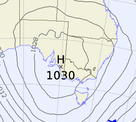
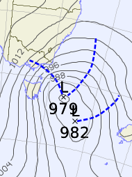
Image: Example of a low and high pressure system.
Fronts
Cold front
A cold front is the boundary between warm air and relatively cooler air. On the weather map it appears as a blue line with small blue triangles (originally chosen because they look like little icicles). As cold, dense air moves through, it wedges underneath the warmer air ahead of it. This causes the warm air to rise, cool and condense into cloud droplets. So, we normally expect to see a blanket of cloud on the leading edge of a cold front, which can produce fairly consistent rain.
Cold fronts are also associated with a change in wind direction and sometimes, a large drop in temperature. Summer cold fronts can lead to increased fire danger as the hot and dry conditions ahead of the front combine with gusty winds and a strong wind change. Winter cold fronts can bring damaging winds and heavy rain. They can also draw cold air up from well south of Australia, which can result in snow falling at very low levels.
Video: A cold front is shown as a blue line with small blue triangles.
Warm front
On the weather map warm fronts appear as a red line with semi-circles (originally chosen because they look like a sun rising bringing warmth). Warm fronts progressively displace cool air with warmer air. Just like a cold front, the temperature change can be quite large once a warm front moves through, although it tends to happen more gradually than a cold front.
Warm fronts appear less frequently than cold fronts over Australia. Even though they bring warmer air, this doesn’t necessarily mean better weather. They can bring steady rainfall, grey skies and more humid conditions.
If a cold front catches up with a slower-moving warm front, they may form an ‘occluded front’. The mix of cold and warm air associated with an occluded front typically brings rainfall.
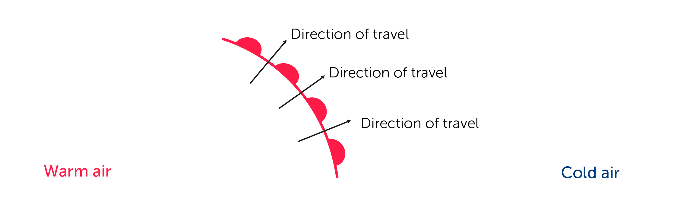
Image:a warm front is shown as a red line with semi-circles.
Troughs
A trough appears on the weather map as a dashed blue line on the chart. It is an elongated area where atmospheric pressure is low relative to its immediate surroundings. Like cold fronts, troughs separate two different air masses (usually more moist air on one side and drier air on the other).
As the trough moves towards the moist air it lifts it. This causes cloud or even showers and thunderstorms to develop. If the trough moves back in the other direction it will drag the moist air with it.
Watch for the monsoon trough which shifts over northern Australia each year. It draws in moist air from the surrounding oceans and this influx of moist air is referred to as the monsoon. The monsoon is associated with cloudy conditions, lengthy periods of heavy rain, occasional thunderstorms and squally winds.
What information goes into a weather map?
We use a wide range of weather information from our observations network to prepare a weather map. This includes observations from over 700 automated weather stations across Australia, Antarctica and offshore islands. We also use information provided by ships equipped with weather stations, and meteorological drifting buoys. Every day at over 30 locations we collect information on the upper atmosphere using an instrument attached to a weather balloon. International satellites supply information that helps us monitor various weather elements such as the upper air winds or temperature and moisture profiles of the atmosphere.
Where can I see weather maps?
Weather maps may present the current situation, what’s happened in the past (a synoptic analysis) or show a forecast for the next few days (a synoptic outlook or prognosis). It can be useful to look at multiple maps in sequence to show movement and change.
For today and the previous six days, see the latest mean sea level pressure analysis.
To find the forecast for the next four days, see the mean sea level pressure prognosis. The hatched lines show approximate areas where rain is expected.
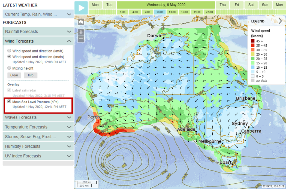
You’ll also notice features of weather maps in other places. For example, in our map viewer MetEye you can toggle on isobars to better understand what’s causing the forecast conditions.
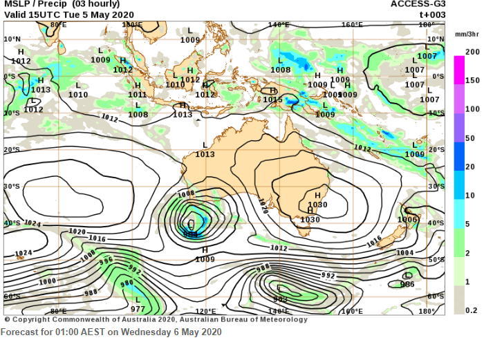
If you need a weather map for a broader area, including the oceans around Australia, you may prefer the Interactive Weather and Wave Map Viewer. It displays model information for a range of areas, including the greater Australian region (below), South Pacific, and the world. These charts are also available for mariners on MarineLite, which are smaller file size versions for easy downloading in areas with limited internet coverage.
If you’re looking for a weather forecast specific to your area, we recommend you check MetEye or your regular 7-day forecast as weather maps only provide a high-level summary of what’s happening.